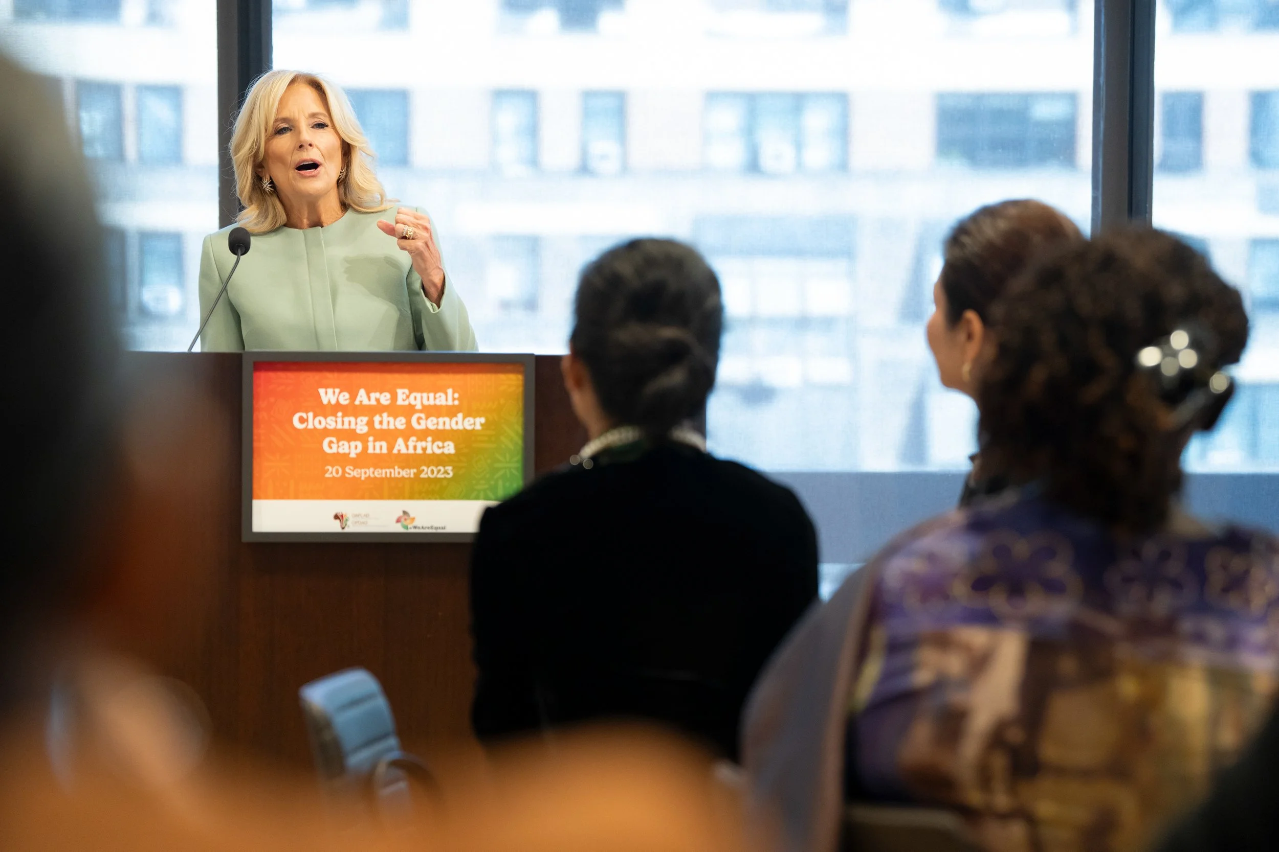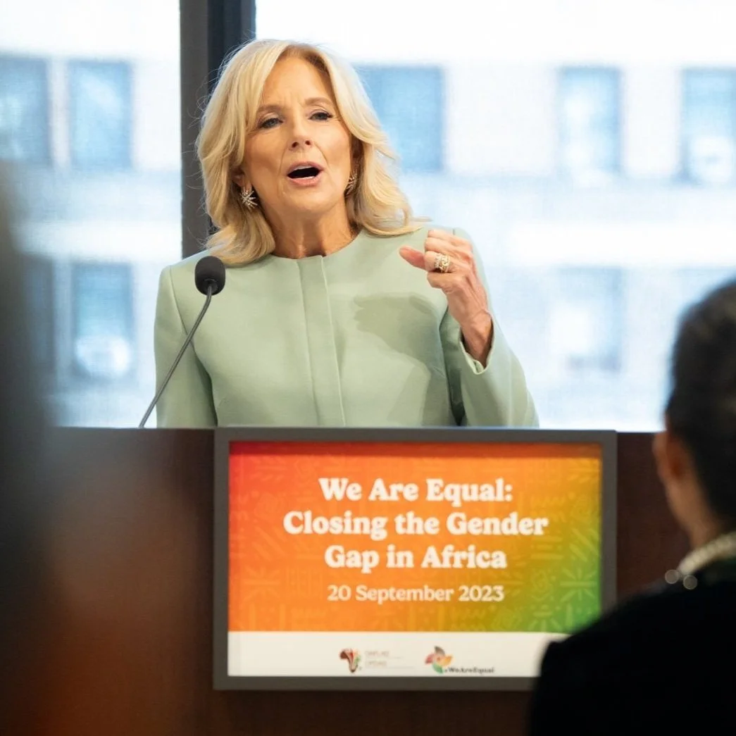
Branding and event signage for #WeAreEqual – a campaign by the Organisation of African First Ladies for Development (OAFLAD) to promote gender equality in Africa.
Team End Polio is a world-class roster of athletes, global leaders, and polio eradication supporters united for a polio-free future. A project led by the Global Polio Eradication Initiative (GPEI), Team End Polio launched in late July of 2024. I was the creative lead of this project, and was responsible for the conception and execution of all branding materials. This included the logo, the crest, all merchandise materials, social graphics, and the custom font used for headers on the website. The team chose to use the orange and blue utilized by GPEI's branding, but wanted a sportier feel than their normal toolkit.
I studied several sports leagues from around the world to get a feel for the kind of branding we wanted to emulate. We wanted a universal feel, nothing too anchored in one sport. Once the logo and the overall look of Team End Polio was decided upon we moved to the creation of materials that could be sent to Team Members, such as a jersey, a hat, and a pin. After those were created we made social media graphics that could be easily shared. In all, the project took about four months to execute from start to finish.
Website Header Image
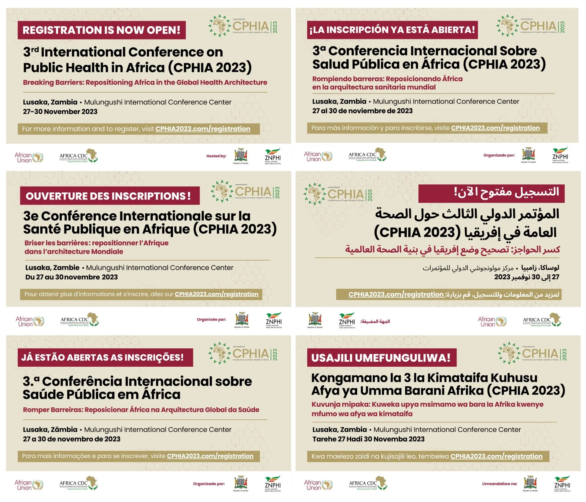
The annual Conference on Public Health in Africa (CPHIA) is organized by the Africa Centre for Disease Control and Prevention (Africa CDC) and provides a unique African-led platform for leaders across the continent to reflect on lessons learned in health and science, and align on a way forward for creating more resilient health systems.
CPHIA 2023 was held in Zambia with the theme “Breaking Barriers: Repositioning Africa in the Global Health Architecture” – which explored across nine plenary sessions, several parallel and abstract sessions and dozens of official side events.
For CPHIA 2023, my first task was wrapping up the annual report from last year’s event, which was a fully designed 59 page PDF with all of the summarized content from the previous year’s conference.
For the 2023 conference I created promotional material for digital and social channels that were translated into 6 languages (English, French, Spanish, Portuguese, Swahili, and Arabic).
To view full report visit: https://cphia2023.com/wp-content/uploads/2023/06/FINAL-CPHIA-2022-Conference-Report.pdf
To view full report visit: https://cphia2024.com/wp-content/uploads/2024/09/CPHIA-2023_Conference-Report_full_15-Mar-2024_reduced-1.pdf
Avo is a Series B start-up that provides white-labeled online stores for residential and commercial companies. Residents and employees can order same-day, no-fee delivery of anything from fresh groceries to electronics. In addition to the online store, Avo also offers commercial companies an employee engagement platform through end-to-end virtual events and gift box experiences.
During my time as a designer at Avo, I worked with the marketing team to create a solid brand for this up and coming business. With a fast-paced environment and a can-do attitude, Avo had a whole range of projects every week. From emails to landing pages, posters to pull-up banners, there was always something new to work on.
One of the biggest projects at Avo was a direct mail campaign that would reach every customer we had in the New York City, Chicago, and Houston markets. For this mailer, I oversaw every aspect of the process from planning to an in-house photoshoot to final design.
Direct Mail Postcard featuring in-house directed photoshoot
Homepage Banner for the website
Custom International Women's Day box design for Prove
Pride Month gift box
Custom gift box designs for Avo clients
Investor pitch deck slides
Email design
The Beethoven Project is a community celebration of Ludwig van Beethoven’s 250th birthday. The Southern Tier of New York is celebrating the life and works of one of the most influential composers of all time through a series of events lasting from September 2019 to December 2020.
The creation of this project, and it’s logo, were proposed to me by The Binghamton Philharmonic. Their ambition was to perform all nine of Beethoven’s symphonies over their next two seasons.
When beginning my research and sketching for this logo, I knew I wanted to incorporate not only notable parts of his life but also the initials for the Beethoven Project. I came up with two final sketches, one featuring an ear as a reference to Beethoven becoming deaf in his later life, and one featuring music notes as a nod to his illustrious career as a composer. Both logos were created to feature a “B” and a “P” somewhere in their design. Different elements of the two logos were combined into a final product that everyone was pleased with.
The Beethoven Project logo is now featured throughout The Southern Tier to promote the various events for this celebration.
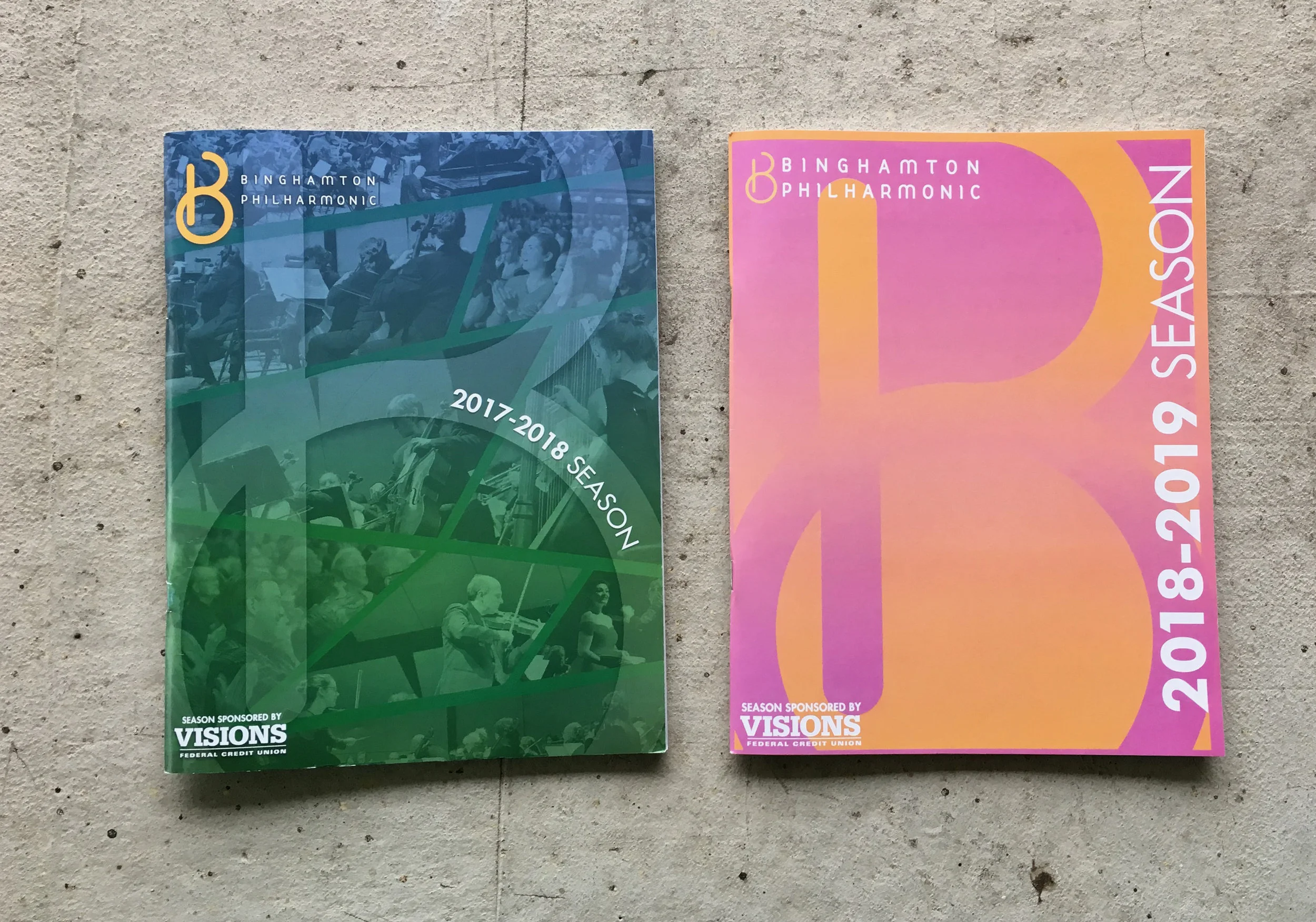
The 2019-2020 Season Brochure for the BInghamton Philharmonic Orchestra, featuring the Beethoven Project logo.
T-shirt Design worn by the Binghamton Philharmonic at various events throughout the season.
A rendition of the Beethoven project logo that was modified for a related event. The BPO was partnering with a local brewery, Binghamton Brewing Co., for a night of beer-tasting and trivia as a fundraiser for the philharmonic. They wanted a funnier logo based on the already existing Beethoven illustration. I added a beer hat, and some custom lettering that I felt matched the logo well.
The “Beerthoven” logo featured on Binghamton Brewing Co. bottles
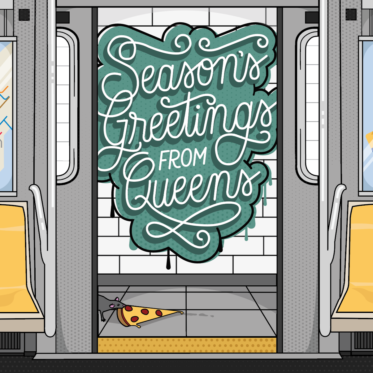
I picked up hand lettering in my sophomore year of college, and have been doing it as a hobby ever since. It allows me to continue to learn about design outside of the classroom, and gives me a creative outlet. I have created countless works utilizing hand lettering and illustration, with the ones included in this section being some of my favorite personal projects.
Holiday Card 2025
Holiday Cards 2021
Holiday Cards 2019
Lettering for my personal business card
Hand-lettered enamel pins for Kappa Delta Phi National Affiliated Sorority
For the last three and a half years, I have been the graphic designer for the Binghamton Philharmonic Orchestra. I have created a wide range of collateral materials for them, including; postcards, digital ads, posters, pull-up banners, website graphics, holiday cards, donor letters, and program books. Most importantly, I have acted as a creative director for the Philharmonic for the last four seasons, crafting the design that would travel through all concerts and events for the entire year.
The Binghamton Philharmonic has worked diligently over the last couple years to bring new and innovative concert experiences to the Southern Tier of New York. I have worked with the Philharmonic to create designs that are as interesting as the concerts they offer.
Burgeon HR is a boutique firm looking to improve the human resources experience for small-scale companies. The clients wanted their company to be named Burgeon as it means to flourish quickly, something they desire for their customers. After several iterations, we decided on a logo that featured overlapping speech bubbles that formed a “B”, a nod to the company name and to the function of an HR department; communication.
White Reversal example of logo with gradient background and company iconography
Gradient altered to fit logo for Pride Month
BoL is an Asian Fusion restaurant located in Ithaca, New York. This branding project began in 2017 where my coworker and I teamed up to create a logo for the brand new eatery. We ultimately came up with a logo that utilized both illustration (my part) and text (his part).
From there, I worked with the owners of BoL to create a design for their menu that would make the ordering process easier for everyone. BoL has an extensive number of options featured on their menu, which focuses heavily on customization. To highlight the customization while making the ordering process convenient and user-friendly, I created a checklist menu that could be handed to the employees after the customer choses their items.
In addition, I created a series of logos for the separate menus that highlight the food they feature. I used these individual icons to create a larger step-and-repeat pattern that is utilized as a background for their take home menu, as well as for social media purposes.